


Striving to produce an exhibition that focused on art outside of our norm, the collective selected 'Quote Unquote' as the theme for its seventeenth exhibition. Each piece in “Quote Unquote” is based on a quote – famous, cultural, or even from the artist’s own life – and is created to represent that quote and its meaning to the artist. The result was an exhibition that saw many styles of literature interpreted in a new light by our artist core.
The efforts of Edmar Cisneros, Rob Shields, Nicolas Monin-Baroille, and Anthony Giacomino shone through as highlights in this exhibition, while the work of one of the latest additions to the collective, Tarin Yuangtrakul, will go down as some of the strongest in the history of slashTHREE.
http://www.slashthree.com/exhibitions/17/
Hope you guys enjoy it, lots of hard work (especially for me) went into this one, so it's very personal again for each contributor.
Promo video by Vladimir Tomin, Creative Director on Slashthree.
First off, the initial idea of illustrating persons has been in my head far before the release of this exhibition. I've always wanted to be able to do tributes for persons I find inspirational. So the base of everything has been the thought and willpower to do something like this.
Soon I've done some research how to slowly get into it, it included lots of hard work finding out a technique that could flawlessly be used on all kinds of pictures maintaining the organic looks I wanted to illustrate, but in my kinda way. I wanted to create something BIG, seeing as most of my work only takes up to a couple hours.
I'm quite happy with all results to be honest, some say it's my best work yet again, others are interested how the piece came together after all. And because of this, I've created this project, involving everyone interested in it to view parts of my workflow.


'One good thing about music, when it hits you feel no pain.' -Bob Marley


1. This was my start base for the work, lots of stuff already has been added in Illustrator, I wanted a kinda funky colorful look. Just like his music would look like, if it was a picture.

2. I've fixed the eye and removed the little type on his shirt. Also fixed his teeth to be more white to the left. Looked much better already. Processed ideas for continuation, background and shirt needed much more work still.

3. Added a lot more detail to his shirt, various patterns and colors fitting to the overall look. A small bit in his face, also pointing out his nose more strongly.

4. Minimal change, white pattern for better contrast to the bold black strokes. Little detail on the shirt added as well.

5. Hair has been fixed, not much major changes. More creative process, thinking of what to do next, slowly getting closer finally working on finalizing it soon.

6. Added another pattern inhis face, colored his moustache slightly, again minor update. Most is done by now.

7. Adding the Slashthree logo, upping contrast and colors with Adjustment Layers.

8. Used a Gradient Map to get more mood into the picture and change the background color while being at it.

9. Washing out the colors with more Adjustment Layers, looking like it's on a good path.

10. Looks like nothing has been done here, barely visible purple Gradient Map set on Lighten, next change is more obvious.

11. Finally the background I've been struggling with all the time, this looked best in the end, again a purple Gradient Map, strongly visible on the logo up top.

12. Blurred the image, put it on Soft Light. Highlights the dark spots and pops up the image quite a bit! Again barely visible but make a huge difference to the viewer. Even when you don't notice it, your subconscious will notice it.


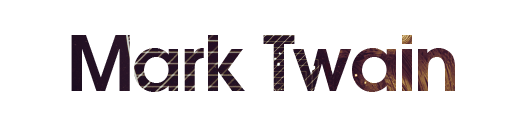

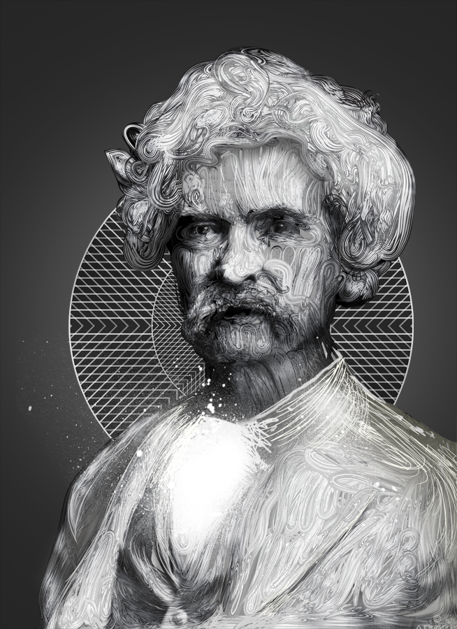
'Courage is resistance to fear, mastery of fear - not absence of fear.' -Mark Twain


1. Background, went for a simplistic but focused one to keep attention to Mr. Twain.

2. Rough brushing work, done with a Wacom tablet for those curious, can also be done with a mouse but is far more difficult because of pressure sensivity.

3. Illustrator Brush lines, roughly painted in AI first and then carefully imported into Photoshop to get everything absolutely right.

4. Using a part of the original picture, I introduced some shadows into the image. More depth in the lines as well.
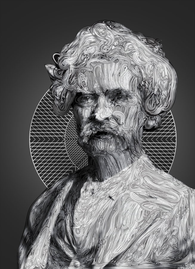
5. Stronger shadows, more details, already a better visible character.

6. More brightness on some spots, shirt and hair mainly.

7. Barely visible but a tad bit darker than before. Starts to look promising now.

9. More light in the face area, brightness upped overall.
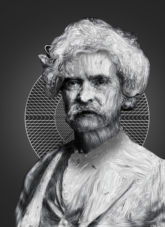
10. Shadow under the neck, supporting the light from above.

11. Shadows on his shoulder, still need a lot of work, darks have been made a bit stronger in some places.

12. Some brush work again, filling in spaces and supporting some gaps.

13. More work on his shirt, doing this so it's a bit brighter.
14. White spatter brush, from the set of Phil Dunne, which you can find here:
http://www.depthcore.com/article/resources/36/
http://www.depthcore.com/article/resources/36/

15. Highlighted a few spots, much better now. Starting to take shape.

16. Again filling in some gaps and going into details.

17. Added some good ol' fuzzy Twain hair.
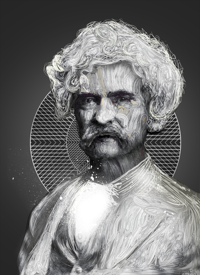
18. More shadow on the neck, adding some slight color, filling in places at the same time.

19. More stuff on the shirt, a bit on his moustache.

20. Hiding an ugly spot and shadowed his shoulder near the neck a little.

21. More depth in his hair, shadows and stuff.

22. Some lighter eyebrow brushing because he doesn't have black eyebrows, obvious choice, really.
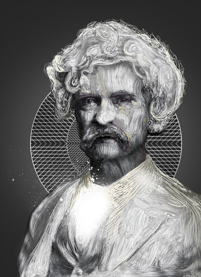
23. Added some purple line on his moustache, not sure why but I guess it was needed.

24. Color introduction, face now is far more alive than before. Coloring this is a difficult task, reference picture was black and white.

25. Stronger whites, hair and shirt more like the original shot.

26. Strong purple to get rid of the grey in the background and so I can start working with the Adjustment Layers.
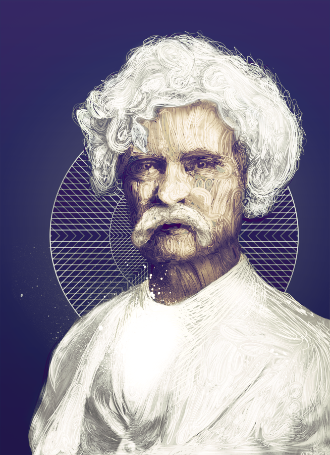
27. Less strength for the whole purple, quite good how this turned from a grey picture into something with a small sense of life.

28. More brightness (once again!) and a softer look for the whole image.

29. Finally darkened, motivation rises again because it doesn't look too bad anymore, various things have been fixed while coloring as well (e.g. nose).

30. Light spots added, again some purple here and there.

31. Shirt is now more white and looks a lot better.

32. Slight color changes, brighter forehead as well.

33. More Adjustment Layer work, contrast is upped.

34. More realistic colors in his face, less purple in those areas.

35. Barely any purple anymore. Calm colors support the overall mood now.

36. Decided to add a bit more vibrancy to it.

37. More contrast and brightness. Finally finished.


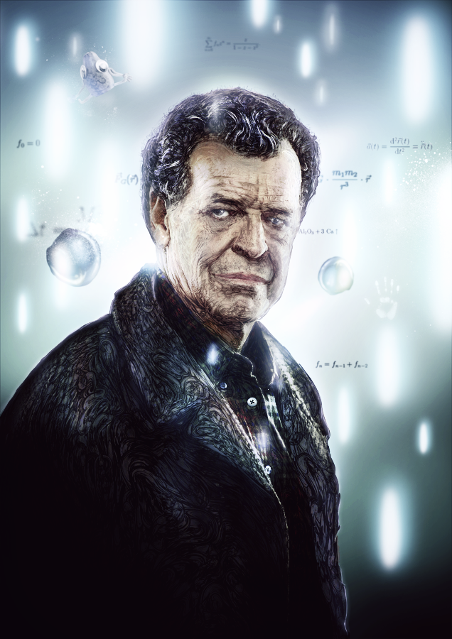
This is a low quality animation, for more graphical pleasure please visit this link:
http://bit.ly/q4Y4qp
*It's a safe link, don't worry about any viruses or else.
http://bit.ly/q4Y4qp
*It's a safe link, don't worry about any viruses or else.


1. Simple background as usual to start off.

2. Bringing in Linework, already brushed with a hard edged Brush (19-30px) in the background to avoid open gaps.

3. Added part of the original picture to get some rough shapes down.

4. Starts to get a face, 2nd time the original picture was used. Basic things like face and shirt now look more distinct.

5. Darkening overall image, adding more and more shadows.

6. Jacket now looks like a jacket.

7. Added highlights in his hair and fixed issues.

8. Added background lights, to have it like the real Fringe intro.

9. Added various basic formulas about physics and other stuff along with self painted elements.

10. Added detail in his eyes, for a more realistic look.

11. Original picture used once again to get the colors exactly as I imagined them to be. I outused it because I wanted this piece specifically to be far more perfect and didn't have much time left (only a few days till Slashthree's release).

12. Brighter face and fixed his right eye.

13. Added dark spots on the bottom to lead the viewers to his face and the overall parts which should be looked at.

14. Brighter background, introducing lights to the front, higher vibrancy as well.
15. More light, less color strength and a little greenish tint.

16. Increased the green tint drastically.
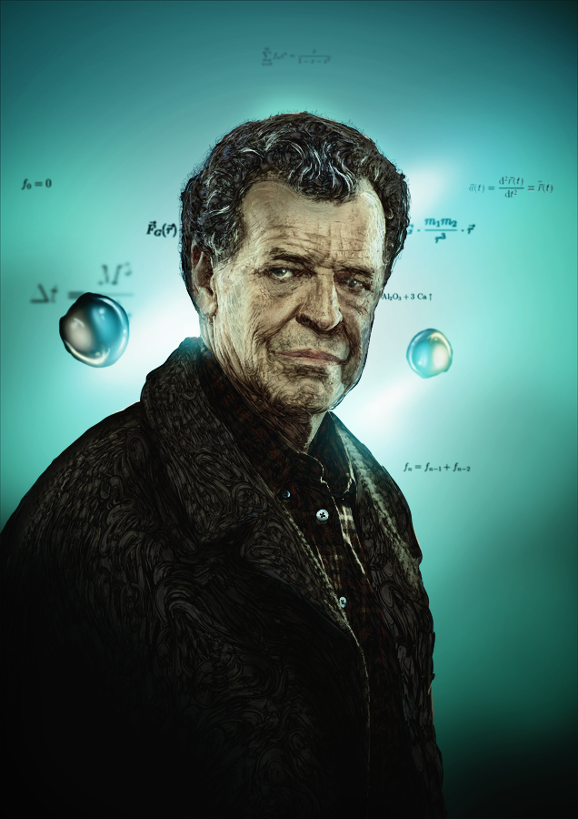
17. Focusing the subject more by darkening the background a bit more. Overall mood is now getting interesting.

18. Added some effects and the famous Mr. Papaya (R.I.P)

19. Adding the vert lights, just adding more of them until step 21.

20.

21. Lights on the body, supporting the vert lights.

22. Even more lights on his body and face.

23. More lights once again.

24. Overall light was increased in the background.

25. Added small detail lights to him.
26. Much more small lights added in the foreground.

27. Small lights now reflect on his jacket and shirt.

28. Added the typical Fringe hand and a light on his jacket once again.

29. More light on his face. Starting to look a lot like the series intro. Next two steps are small things that are barely noticeable, stuff on the face mostly.

30.

31.

32. Huge color change, instead of the annoying green tone.
33. Stronger light, stronger atmosphere.

34. Higher contrast.

35. Darkened the upper corners.

36. Higher contrast again. Shows impact now when looking at it.

37.Added the Slashthree (http://slashthree.com/) logo and my own website to the top (http://www.theunknownbeing.com/).

38. Added a bit of grain to the image, image stays strong but isn't over the top.


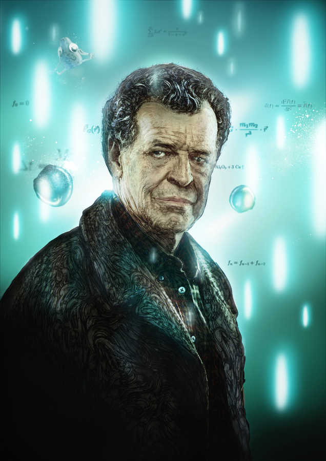
This is a low quality animation, for more graphical pleasure please visit this link:
http://bit.ly/nUpQX0
*It's a safe link, don't worry about any viruses or else.
http://bit.ly/nUpQX0
*It's a safe link, don't worry about any viruses or else.
Thank you very much for dropping in and reading this, taking the time to understand my process and ideas.
-
THE UNKNOWN BEING serving Slashthree's Quote/Unquote
-
http://www.theunknownbeing.com/
-
THE UNKNOWN BEING serving Slashthree's Quote/Unquote
-
http://www.theunknownbeing.com/


